What is Colour?
Without light there is no colour and light is the source of all life. It is the reflection of light rays which comprise the colour spectrum.
Everything is measured in wavelengths and each colour has its own wavelength too. Angela Wright aptly explains it as these wavelengths consist of photons, or atmospheric particles of energy which, when they strike an object, will be absorded or reflected, depending on the pigments that the object contains. A coloured object absorbs only the wavelengths which exactly match its own atomic structure, and reflect the rest – which is what we see.
What is the Colour Spectrum?
The colour spectrum comprises of these colours:


What are Primary Pigment Colours?
Red
Yellow
Blue
What are Secondary Colours?
A mixture of 2 Primary colours
What are Tertiary Colours?
A mixture of a Primary and a Secondary colour
Technical Colour
White | is total reflection
Black | is total absorption
Grey | is equal quantities of Red, Yellow and Blue
Hue | a variety of colour caused by admixture of another (Oxford Dictionary)
Tint | White added to hue – creating Pastels
Shade | Black added to colour = Darks
Tone | Grey added to hue – creating Mediums
Monochromatic | contains tints, shades and tones of only one colour
The Colour Wheel
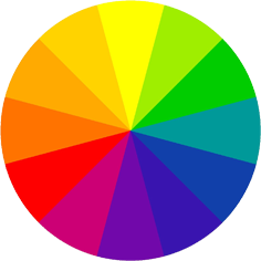 This comprises 12 pure colours of the colour spectrum. The spectrum is achieved by sending white light rays through a glass prism. Like the formation of a rainbow drops of water in the sky which act as millions of tiny prisms.
Decorating with Colour
Red and yellow are warm colours and are inclined to move forward and make a room seem smaller and cosier. The deeper, brighter or darker the tone, the stronger it will stand out. The paler the tone, the larger the room will appear.
Lime-green contains yellow and has a warm colour.
Purple (blend of blue + red) can be warm or cool, depending on it’s co-ordinated colours.
Purple stands out next to blue
Purple recedes next to yellow
General Rule
Use cool colours in a warm room north facing and warm colours in a cold room south facing.
Colour Schemes
Use of harmonising colours a tranquil environment will be your result.
Use of contrasting colours a stimulating and dynamic space.
Optical Illusions and Difficult Shaped Rooms
When room is too long and narrow paint the 2 short walls a darker hue in a warm colour and 2 long walls in a paler shade in a cool colour
When ceiling is too high paint the ceiling and cornices in a warmer or darker hue than the walls.
When the ceiling is too low paint it white or a paler hue than the walls
When the room is too small and square
The walls can be 2 hues lighter than the floor
Paint the ceiling white
Paint door and window frames the same as the walls
When the room is too large
The floor can be dark warm colours with loose carpets
The walls can be darker hues
The ceiling can be a lighter hue of the walls
Door and window frames can contrast the walls
Curtains and upholstery may be big bold designs and colours
Colour Co-ordination
Use the 70% 20% 10% theory.
70% = your main colour which is the shell
20% = your contrasting colour which provide depth and interest
10% = your highlight colour which adds the drama
70%
20%
10%
Big areas should be muted and small objects bold
Repetition leads the eye through a room and integrates the scheme to become part of a successful whole
Combine patterns, flow colour, consider light influence and utilise � fashion � colours in a removable or changeable context so that updating next season is cost-effective